Zentrale Anlaufstelle Barrierefrei


Barrierefreie Dokumentenerstellung in Word 2019/ Word 365
Die folgende Anleitung beschreibt, wie man Dokumente bei Word 365 bzw. Word 2019 barrierefrei gestaltet. Der erste Teil besteht aus den Grundlagen die bei jedem Dokument, welches man erstellt, beachtet werden müssen. Darüber hinaus gibt es noch einen Vertiefungsteil. Dieser behandelt Elemente, die zwar nicht in jedem Dokument auftauchen, aber dennoch beachtet werden müssen, wenn man sie verwendet.
Es gibt von Microsoft Informationen zur barrierefreien Dokumentenerstellung. Außerdem gibt es einen LinkedIn Learning Kurs zur barrierefreien Dokumentenerstellung an dem Beschäftigte der Universität Bielefeld kostenlos teilnehmen können.
Grundeinstellungen
Damit die Schrift gut lesbar ist, sollten folgende Punkte beachtet werden:
- Verwendung von serifenloser Schrift (z.B. Arial, Helvetica)
- Vermeidung von sehr feinen oder sehr fetten Schriftstärken
- Vermeidung von schmalen oder breiten Schriftweiten
- Zeilenabstand sollte 150% der Schriftgröße betragen
- Sparsamer Einsatz von Farben, schwarze Schrift auf weißem Hintergrund ist optimal
- Vermeidung von der Farbkombination Rot-Grün sowie Komplementärfarben (z.B. Blau-Orange)
- Falls doch ein farbiger Hintergrund ausgewählt wurde: auf hohen Kontrast für den Text achten
In diesem Word-Template wurden die oben genannten Punkte bereits angepasst. Dieses können Sie gerne für Ihre Zwecke verwenden:
Formatvorlagen
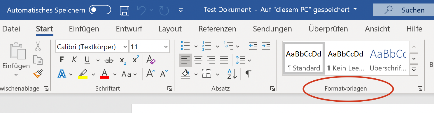
Das Benutzen von Formatvorlagen ist eine Grundvoraussetzung zur Erstellung von barrierefreien Dokumenten. Formatvorlagen geben dem Dokument eine Struktur wodurch Screenreader sie leichter vorlesen können.
Verwenden Sie deshalb eine logische Reihenfolge für Ihre Überschriften. Danach können Sie diese ganz einfach mithilfe der integrierten Formatierungstools in Word formatieren. Dazu markieren Sie erst die Überschrift, die Sie formatieren möchten. Danach gehen Sie auf der Registerkarte auf den Reiter Start und können hier eine der Formatvorlagen auswählen. Nutzen Sie die Formatvorlage "Überschrift 1" für Hauptüberschriften, "Überschrift 2" für Untertitel "Überschrift 3" für Zwischentitel und so weiter. Hierbei sollte immer mit "Überschrift 1" angefangen werden und keine Überschriftenebenen übersprungen werden. Falls die Formatvorlagen nicht gefallen sollten, kann man diese abändern. Dazu geht man mit dem Cursor auf die jeweilige Formatvorlage, klickt auf die rechte Maustaste und wählt die Option Ändern aus. Nun können Absätze, Schriftart und weitere Einstellungen nach eigenen Wünschen angepasst werden.
Dokumenteneigenschaften
Genaue Angaben zu Dokumenten helfen Menschen mit einer Sehbeeinträchtigung dabei, mit unterschiedlichen Dokumenten zu arbeiten und sie besser zu verwalten. Dazu gehören Eigenschaften wie Titel oder Autor, die man jedem Dokument hinzufügen sollte. Diese Einstellungen findet man unter folgendem Pfad:
Windows: Über die Registrierkarte Datei > Informationen und kann diese dort Einfügen oder Abändern.


macOS: Über die Menüleiste Datei > Eigenschaften. In dem sich öffnenden Fenster kann man nun unter dem Punkt Zusammenfassung die Dokumenteigenschaften eingeben.


Barrierefreiheitsprüfung


Die Barrierefreiheitsprüfung dient dazu, in einem Dokument nach Elementen zu suchen, die nicht barrierefrei sind.
Gehen Sie auf den Reiter Überprüfen und dann auf den Punkt Barrierefreiheit überprüfen. Es wird Ihnen eine Liste mit Fehlern, Warnungen und Tipps sowie den entsprechenden Empfehlungen für die Vorgehensweise zum Korrigieren angezeigt. Wenn Sie nun ein angezeigtes Problem auswählen, erfahren Sie warum Sie dieses beheben sollten und es werden Ihnen hierfür die genaue Vorgehensweisen angezeigt.
Auch wenn der Großteil der Barrierefreiheitsprobleme durch die automatische Barrierefreiheitsprüfung erkannt wird, gibt es einige, die das Programm nicht erkennen kann. Deshalb ist es wichtig das Dokument noch einmal manuell zu überprüfen. In unserem Portal ist beschrieben nach welchen Schemata wir Dokumente auf Barrierefreiheit überprüfen.
PDF-Export
Nachdem Sie Ihr Dokument auf Barrierefreiheit geprüft haben, kann es nun als PDF-Dokument exportiert werden. Herbei ist es wichtig, dass das Dokument mit den passenden Einstellungen als PDF exportiert wird da sonst die gesamten Barrierefreiheitsinformationen nicht in die PDF überführt werden.
Windows: Gehen Sie über den Pfad Datei > Exportieren > PDF/XPS-Dokument erstellen. Es öffnet Sich ein neues Fenster, in dem der Speicherort gewählt werden kann. Bevor Sie die Datei jedoch speichern, klicken Sie auf den Button Optionen.... Es öffnet sich ein weiteres Fenster. Setzen Sie jeweils einen Haken bei den Punkten Dokumenteigenschaften und Dokumentenstrukturtags für Barrierefreiheit und bestätigen dies mit OK. Daraufhin schließt sich das Fenster und Sie können nun auf den Button Veröffentlichen klicken. Die Datei ist nun gespeichert.


macOS: Klicken Sie auf der Symbolleiste auf die drei nebeneinanderstehenden Punkte und wählen Sie die Option Speichern unter aus. Daraufhin erscheint direkt links neben den drei Punkten ein Festplattensymbol. Wählen Sie dieses aus. Danach öffnet sich ein neues Fenster. Klicken Sie auf das Einblendmenü neben dem Stichpunkt Dateiformat unten im Fenster und wählen Sie die Option PDF aus. Anschließend wählen Sie nun den oberen Punkt Optimal für elektronische Verteilung und Barrierefreiheit aus. Zum Schluss klicken Sie auf den Button Exportieren.


Tabellen
Vor allem Tabellen in Dokumenten können für Menschen mit einer Sehbehinderung eine große Herausforderung sein. Deshalb sollte der Aufbau möglichst übersichtlich sein. Folgende Punkte helfen Ihnen dabei eine Tabelle möglichst überschaubar und somit barrierefrei zu gestalten.
Tabellenbeschreibung
Eine Tabellenbeschreibung ist sowohl für Menschen mit als auch ohne Sehbeeinträchtigung sinnvoll, um zu erkennen, welche Inhalte die Tabelle aufweist. Um eine Tabellenbeschreibung hinzuzufügen, klicken Sie in die Tabelle und machen Sie anschließend einen Rechtsklick auf das Kreuz oben links an der Tabellen-Ecke. Es öffnet sich ein Menü und Sie wählen dann den Punkt "Beschriftung einfügen" aus. Nachdem Sie die Beschriftung eingetragen haben, können Sie diese mit einem Klick auf OK übernehmen.
Verwendung von Titeln und Alternativtexten
Titel und Alternativtexte helfen Menschen mit einer Sehbehinderung dabei Tabellen besser zu verstehen und sollten deshalb vor allem bei komplexeren Tabellen eingesetzt werden.
Windows: Klicken Sie auf eine beliebige Stelle in der Tabelle und gehen mit dem Cursor auf das Kreuz rechts oben in der Tabellenecke. Machen Sie einen Rechtsklick und wählen die Option Tabelleneigenschaften aus. Es öffnet sich ein neues Fenster. Wählen in dem neuen Fenster den Reiter Alternativtext aus. Nun können Sie Titel und Alternativtext der Tabelle einfügen.


Aufteilen in kleinere Tabellen
Besonders große und komplexe Tabellen lassen sich durch einen Screenreader nicht optimal vorlesen. Deshalb sollten diese, wenn es möglich ist, in mehrere kleine Tabellen aufgeteilt werden.
Erste Spalte


Bei vielen Tabellen enthält die erste Spalte Überschriften, die den Inhalt der Tabelle beschreibt. Damit ein Screenreader dies richtig wiedergeben kann, sollte die erste Spalte als solche markiert werden. Gehen Sie dazu auf den Reiter Tabellenentwurf und aktivieren Sie das Häkchen bei dem Punkt Erste Spalte.
Kopfzeile
Auch die Kopfzeile einer Tabelle sollten als solche markiert werden, damit sie von einem Screenreader richtig vorgelesen wird. Klicken Sie auf eine beliebige Stelle in der Tabelle gehen Sie auf den Reiter auf Tabellenentwurf. Danach aktivieren Sie links das Häkchen für die Option Kopfzeile.


Damit die Kopfzeile auch bei einem Seitenumbruch erkenntlich bleibt gehen Sie wie folgt vor: Klicken Sie hierzu mit der rechten Maustaste in ein Feld der ersten Tabellenzeile, wählen Sie den Punkt Tabelleneigenschaften aus und gehen danach auf den Reiter Zeile. Setzen Sie nun ein Häkchen bei dem Punkt Gleiche Kopfzeile auf jeder Seite wiederholen und bestätigen Sie dies mit Ok.


Ergänzende Informationen
Jede Zeile einer Tabelle muss dabei die gleiche Anzahl an Spalten aufweisen, damit Inhalte der richtigen Spaltenüberschrift zugeordnet werden können. Das heißt es sollten keine Tabellenzellen zusammengeführt werden.
Grafiken


Jedes Bild in einem Dokument muss durch einen Alternativtext beschrieben werden, welcher wiederum Nutzern von Screenreadern vorgelesen wird. Grafiken, die nicht zum Inhalt beitragen und das Dokument nur schöner aussehen lassen sollen benötigen keinen Alternativtext. Diese Grafiken müssen lediglich als "dekorativ" gekennzeichnet werden. Screenreader überspringen diese Grafiken und lesen sie nicht vor. Wenn man Alternativtexte hinzufügt, sollte man sich nicht auf den automatisch eingestellten Alternativtext verlassen.
Um einen Alternativtext hinzuzufügen, wählen Sie im ersten Schritt die Grafik aus, in dem Sie mit der Linken Maustaste auf diese klicken. Danach gehen Sie über den Reiter auf Bildformat und wählen den Punkt Alternativtext aus. Auf der rechten Seite der Oberfläche öffnet sich nun ein Fenster, in welches Sie den Alternativtext einfügen können.
Links
Wenn Sie in ihrem Dokument einen Link einfügen möchten, sollte dieser von einem Screenreader verständlich vorgelesen werden können. Besonders für Personen, die einen Screenreader benutzen, ist diese zusätzliche Information genauso hilfreich wie ein Alternativtext bei Grafiken. Links sollten nicht aus ganzen Sätzen bestehen oder nur aus einem einzelnen Wort. Der Link sollte gerade soviel Text umfassen, dass man aus dem Text versteht, worum es sich bei dem Link handelt.
Windows: Klicken Sie mit der rechten Maustaste auf den eingefügten Link und wählen Sie die Option Hyperlink bearbeiten aus. Nun können Sie in der Zeile Anzuzeigender Text angeben, was anstelle des Links dort erscheinen soll. Danach geben Sie das Ziel des Links in der Zeile Adresse an. Zum Schluss klicken Sie auf den Button Quickinfo oben rechts und geben dort einen Hinweis an, welche Informationen man über den Link bekommt.


macOS: Klicken Sie mit der rechten Maustaste auf den eingefügten Link und wählen Sie die Option Link > Link bearbeiten aus. Nun können Sie in der Zeile Anzuzeigender Text angeben, was anstelle des Links dort erscheinen soll. Danach geben Sie das Ziel des Links in der Zeile Adresse an. Zum Schluss klicken Sie auf den Button Quickinfo oben rechts und geben dort einen Hinweis an, welche Informationen man über den Link bekommt.


Der Link ist nun übersichtlich in dem Dokument eingebaut und es steht dort beispielsweise "Uni Bielefeld" anstelle von "www.uni-bielefeld.de".
Listen


Wenn Sie Informationen durch eine Aufzählung übersichtlich wiedergeben möchten, sollten Sie die Standard Listenfunktion von Word benutzen. Um eine Liste zu erstellen gehen Sie an die gewünschte Stelle im Dokument und wählen Sie über die Registerkarte den Punkt Start > Nummerierung aus. Hier können Sie die Formatierung auswählen. Sie sollten allerdings keine römischen Ziffern verwenden, da diese von einem Screenreader nicht richtig vorgelesen werden.
Zeilen- und Absatzabstände


Menschen mit einer Sehbehinderung können Textinhalte teilweise nicht klar erkennen. Um eine bessere Lesbarkeit zu gewährleisten sollten Sie deshalb größere Abstände zwischen den Zeilen und Absätzen innerhalb eines Textes verwenden.
Zeilenabstand: Gehen Sie auf der Registerkarte auf den Reiter Start und danach auf das Symbol Zeilenabstand. Hier können Sie den Abstand auf 1,5 erhöhen.
Absatzabstand: Absatzabstände sollten nicht manuell (durch das mehrfache Drücken von Enter) gesetzt werden. Stattdessen sollte er im Vorhinein eingestellt werden und mindestens 18 pt. betragen. Gehen Sie hierfür erneut auf das Symbol Zeilenabstand und wählen Zeilenabstandsoptionen... aus. Es öffnet sich ein neues Fenster. Unter dem Punkt Abstand wählen Sie nun bei der Option Nach mithilfe der kleinen Pfeile rechts neben dem Feld 18 pt. aus.
Kopf- und Fußzeile
In die Kopf- und Fußzeile eines Dokumentes, sollten keine wichtigen Informationen geschrieben werden. Ein Screenreader kann Informationen hieraus nicht erkennen und somit nicht vorlesen. Weniger wichtige Inhalte, wie z.B. Logos, welche sich auf jeder Seite wiederholen, können in Kopf- und Fußzeilen hinzugefügt werden.
In dem folgenden Word-Dokument werden die einzelnen Punkte dieses Tutorials noch einmal anhand von Beispielen anschaulich erläutert:
Beispiel_Barrierefreies_Word_Dokument.docx